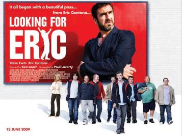
During the lesson we watched the trailer to ‘LOOKING FOR ERIC’ and analysed the various posters that were released of it. It was a clever marketing technique to release a variety of posters as it attracts attention from all audiences as each convention is changed which makes each poster specific towards the target audience it is attracting.
From the trailer it gives off the impression that the main character is quite gloomy and has had a hard life for the past few years and he turns to inspiration from Eric Cantona for help and guidance in his life. Through the beginning sequence of the trailer the music is quite sad and slow paced to reference the mood that the character is in and how unfulfilling his life is however when Eric Cantona appears on the screen the music is instantly uplifting and lightens the mood.
It is instantly recognsible as a British film as they are often linked to a more rough style of living, which is portrayed through the setting and environment and also the colours used link into the British film genre as it is quite dull and dreary which is often used to reflect the weather that is commonly associated with the United Kingdom.


This poster is used to attract a different audience as it has a ‘ROM COM’ feel to it which would most likely attract women. The use of round edges on the letters give a slightly more feminine touch to the titles as they are curved and neat rather than jagged and rough which is usually used for some action films ETC.
The main character Eric is holding flowers which are a common gesture of romance and the body language of himself and the woman in the shot with him show that they are a couple. However links to a comedic genre are used as Eric is not looking at his partner but his eyes are drifting and looking towards Eric Cantona to almost show to the audience that his love for Cantona is bigger than his real life love which shows that he has more time for Eric. This gives away hints to the romance side of the storyline in the film and also the use of the image of Eric Cantona shows that he is a guide to the main character as he takes up the majority of the poster and has quite a serious look on his face, the key thing to point out is that the image is slightly faded which shows that he almost isn’t there.
This poster has been created in such a way to attract British film fans as it is made in a ‘quirky British style’. This is done by showing all the individual characters personalities in such a way as to portray the film without giving too much away and it simply showcases the nature of the storyline.
This is done by the use of their body language, for example many of the men are shown in a ‘lad-ish’ sort of way to portray them as quite rowdy and typical British men. And the female characters body language portrays the relationship she has with the main character who is her partner as she is quite stubborn in her demanour which represents perhaps, the arguments they have in the film.


Leave a comment