Archive | Ancillary Text RSS feed for this section

COMPLETED FILM REVIEW ON PHOTOSHOP.

9 Apr

Above is an image of my completed film poster. After the initial stages of creating the actual wording of review, I have altered it slightly from the second draft. For example, I had to change the wording of: –

Amongst the the astounding acting skills of Ali Hussain and the wit of new kid on the block Kenneth Busumbru, wonders in directing and producing, the excellence in mise en scene will really get you into the feel of the movie.”

To the slightly altered: –

 “Amongst the the astounding acting skills of Ali Hussain, and the wit of new kid on the block, Kenneth Busumbru teamed up with the wonders in directing, will really get you into the feel of the movie.”

This was because once I proof read the article as a whole element including the imagery, the wording sounded slightly lacklustre and needed a little bit of tweaking.

Also I spaced out two of the paragraphs so it would be easier to read as my opening paragraph is quite long as it is, so to have two big blocks of writing is displeasing to the eye and is not in the style of Little White Lies, therefore this needed to be changed.

(PLEASE NOTE: The colour pink used on the pink box and pink text has been enhanced on wordpress. Originally it was a paler pink which was more similar to that of which is used in Little White Lies, but the transition from photoshop to wordpress has slightly altered the colour)

CREATING MY REVIEW ON PHOTOSHOP.

7 Apr

Once I had completed my review I began to piece it together visually on photoshop. I decided to do a single page spread as I thought that with the budget, marketing and audience that is ideal for my film it would not be one in which is a Hollywood blockbuster therefore it wouldn’t have the whole magazine dedicated to it such as the ‘Black Swan’ edition or the ‘Drive’ edition. So I decided a single page would be best as it is more realistically fitting that way.

After opening a new document to the exact size of the little white lies page I then began to draw lines with the ruler tool in order to create margins and gaps between each margin. This was a slightly time consuming task as it was essential to make sure that the lines were in a specific place.

The next step was to create text boxes and transfer the bulk of my review onto the review format in the layout style of Little White Lies. A difficulty I faced was as I had a lot of text I had to keep rearranging the text so it would look better as a completed review.

Also to fit in with the house-style of Little White Lies I had to add onto the end the three points they make in relation to, ‘anticipation’, ‘enjoyment’ and ‘in retrospect’.

To create the real effect of Little White Lies, I decided to analyse various other rating systems they had to ensure that what I decided to write would not be different to the usual style they go for.

My next step was to add an image that I thought would be appropriate and fitting for the review. Initially due to the lighting environment in which it was originally filmed in, the image is quite dark. Therefore through photoshop I brightened it to make it clearer and less blurry.

I then created colour shapes as backgrounds to the title, release date ETC as this is what is done in Little White Lies. I tried to get as close to the original colour in the magazine as I possibly could.

Next I added in the text to the titles and used the same colours as there would be in their magazine when it is a white single page spread.

Once I had completed all these steps I realized I had forgotten a small but important detail, which is the block colour of black in a small circle which encases the number rating that is given to the reviews. This was my final step in creating my review as I thought it was important to get all the details right as they are what truly creates a specific brand.

And below is a picture of my complete review! (An analysis of my completed review can be found at the above blog)

FINAL DRAFT OF MY REVIEW.

30 Mar

After a discussion with my teacher I tweaked and edited my review and shuffled the paragraphs in order for it to fit in with the style of Little White Lies magazine.

Below is the final draft of my review ☺

PROJECT PARANOIA

The expertise and know-how skills of the director Sumaiyah Khan Anwar, more widely known for her directing abilities in the emotionally tantalizing film ‘The Lonely Soul’, shows that she has found her niche in the film industry after a lull in her career, as she springs onto the scene for a second time with ‘Project Paranoia’. What is it they say? It’s like riding a bike, you never forget. This mixed in with the accomplished work of Shahriyar Rahman (highly acclaimed director of ‘Bloodshot’) as producer creates a concoction of two separate worlds intertwining in order to construct a uniquely individual film.

Through the alluring interpretation of first hand experiences with the controversial subject of schizophrenia the actors take to their roles like a fish to water. Now, at this point you might be thinking ‘well this sounds like a one way ticket to depression valley!’ but have fear not, this is stopped in its tracks with the pioneering comical twist with the abilities of first time actor Kenneth Busumbru.

A psychologically invigorating depiction of a troubled man with schizophrenia, toys with the audiences mind through the visual representation (portrayed by actor Ali Hussain, which is also the main characters name) of the turmoil from within his mind. We take a gripping journey with Hussain as he battles with his demon within. What’s going to happen to him? Will he do it? He wouldn’t, would he? Are the kind of questions you will find yourself asking while you’re entangled in the storyline. Without giving too much away about the comedic twist midway through, it will have you wondering whether it’s reality or not, or just a figment of his imagination. But hey, that’s for you to decide.

Amongst the the astounding acting skills of Ali Hussain and the wit of new kid on the block Kenneth Busumbru, wonders in directing and producing, the excellence in mise en scene will really get you into the feel of the movie. It will take you on an emotional rollercoaster ride to the unknown; all you can do is buckle up and get ready for the ride.
 
Overall, I believe that ‘Project Paranoia’ is a film that is a guaranteed thrill seeker with a pinch, well a spoonful, of humour! Despite their mediocre budget, the team pull together all their resources to create a truly groundbreaking piece of cinematography.

CREATING MY OWN REVIEW.

22 Mar

After looking at previous students work to get a feel of how to adapt to emulating the ways of Little White Lies I began to write my own review. Also armed with a writing frame to keep me on track with the layout and structure of LWL reviews I felt prepared enough to create my own.

Below is my first draft of my review.

‘PROJECT PARANOIA’ REVIEW. (first draft)

Possibly one of the most psychologically gripping films ‘Project Paranoia’ plays with your own interpretation of storylines via the sudden comedic element. The astounding acting skills of Ali Hussain and the wit of new kid on the block Kenneth Busumbru create something new for the world of cinema.

Through the alluring interpretation of first hand experiences with the controversial subject of schizophrenia the actors take to their roles like a fish to water. Now, at this point you might be thinking ‘well this sounds like a one way ticket to depression valley!’ but fear not, this is stopped in its tracks with the pioneering comical twist.

The expertise and know-how skills of the director Sumaiyah Khan Anwar, more widely known for her directing abilities in the emotionally tantalising film ‘The Lonely Soul’, shows that she has found her niche in the film industry after a lull in her career, as she springs onto the scene for a second time with ‘Project Paranoia’. What is it they say? It’s like riding a bike, you never forget. This mixed in with the accomplished work of Shahriyar Rahman in the highly acclaimed ‘Bloodshot’, as producer creates a concoction of two separate worlds intertwining in order to construct a uniquely individual film.

A psychologically invigorating depiction of a troubled man with schizophrenia, toys with the audiences mind through the visual representation of the disarray from within his mind showcased onto the big screen. We take a gripping journey with Ali as he battles with his demon within. What’s going to happen to him? Will he do it? He wouldn’t, would he? Are the kind of questions you will find yourself asking while you’re caught into the storyline. Without giving too much away about the comedic twist midway through, it will have you wondering whether it’s reality or not, or just a figment of his imagination. But hey, that’s for you to decide.

Amongst the high standard acting quality, wonders in directing and producing, the excellence in mise en scene, and not to forget the impeccable skilled editing which truly helps to put the final pieces of a schizophrenic puzzle, will really get you into the feel of the movie. It will take you on an emotional rollercoaster ride to the unknown, all you can do is buckle up and get ready for the ride.

Overall, I believe that ‘Project Paranoia’ is a film that is a guaranteed thrill seeker with a pinch, well a spoonful, of humour! Despite their mediocre budget, the team pull together all their resources to create a truly groundbreaking piece of cinematography.

ANALYZING REVIEWS FROM LITTLE WHITE LIES.

15 Mar

In order to be able to fully duplicate the style and format of Little White Lies magazine I must analyse an article to get to grips with it. Throughout the whole magazine there is a consistent layout, font type, style ETC which allows you to get to know the house style of the  magazine which is vital in order to create a brand as it enables customers to know what to expect from it.

These three different reviews all have the same house layout ETC so when you see one of them you will instantly know what magazine it is from which will represent good marketing as a brand will be created and a loyal readership will emerge.

I analyzed a LWL review of ‘Shrek Forever After’ issue #30, page 083. The language used in the review is formal with a hint of humour added here and there to give it a slightly informal feel in places which echoes to me that it is aimed at an intellectual audience, one in which is constantly educating themselves which is why LWL is not afraid of the terminology they use as their reader will understand it and want to be challenged.

The adjectives used are a key aspect of film review which the writer can sell the movie or steer their audiences away. In the ‘Shrek Forever After’ review it says the film is ‘looming a shadow now cast in 3D’ this creates a slightly ominous and dark image of the film as it uses the words looming and shadow which initially make you think of things that are quite scary which is not what you think a Shrek film would be about! However further along in the review it says it is ‘a breath of fresh air’ which plants a seed in your mind of something new and innovative with an all round happy feel to it. Also this may help draw in new audiences as it can bring in people who due to their own interpretations and opinions of the previous films didn’t like the films and now may want to see it as it is being sold to the audiences as different to the other ones.

A specific quote that I thought would really bring in the audiences was ‘it pops, fizzes and sparks with added vitality’ there is an array of other words that the writer could have used but the specific use of pops, fizzes and sparks brings in the idea of something exciting and it makes you want to see it as it sounds exhilarating.

The mode of address and expectations of the audience knowledge is one of a high standard. In the review it references ‘Far Far Away’ which is in the previous Shrek films which means that it has the assumption that the readers will have seen the films before or have a basic knowledge of them. LWL is clearly aimed at avid film fans as not only in this review but throughout the magazine film language and film references that are not the film that is being reviewed are always made which sets the standard they have for their audience.

The use of colours in the magazine is something that cannot be ignored as the bright colours is a key staple of Little White Lies.  You may think that the use of such bold block colours will distract from the actual text but this is in fact, not the case at all. They simply enhance your attention towards it and draw you in.

The rating system is where it tells you whether or not they liked the film and if they are going to encourage or discourage you to watch it. In the case of ‘Shrek Forever After’ it bigs up the visual imagery in the film and all in all says it is very good but doesn’t leave you wanting more. This could be argued to be both good and bad. Good in the sense that the storyline rounds off well in the film and doesn’t leave you asking any questions, but bad in the sense that it makes you think if there is to be another Shrek film after it will not be as good, which doesn’t give you a positive view if that were to happen. (Although this was in fact the last one! Minus the many little Shrek related shows made)

Finally the structure of the review if in paragraphs, each dedicated to a separte part of the story. The first few introduce to you the style of the writers, the director ETC and let you understand the behind the scenes people. The middles describes the film with jokey references throughout, E.G ‘1980’s Miami disco’.  And the end sums up the film and their opinion on it, the last line in this particular review says ‘This is a final fitting chapter for the franchise’ which leaves you thinking that the film is worth watching and thus the review has done its job.

LITTLE WHITE LIES MAGAZINE.

6 Mar

WHAT STRIKES YOU MOST ABOUT THE MAGAZINE?

The vibrant bursts of colour on the front cover is an instant eye-catcher as commonly people are more enticed to brighter colours and more abstract pictures, which is exactly what the front cover offers. Also the detail taken into the style of writing and the mass amount of indepth text also strikes me most about the magazine as it shows that it is not thrown together in a sloppy manner, but has had a lot of thought and precision taken into consideration when it was being created.

WHAT’S MISSING?

Although the large amount of text shows the detail of the work, it does however make it quite a task to read, therefore it is missing the vital breaks in paragraphs needed in order to have a freely flowing magazine which constantly keeps the reader entertained.

It is also missing extra information that some film enthuasists may want to know, such as where it was filmed ETC. Although this may seem as a menial task to put down however due to the fact that it is an entirely film related magazine it might be helpful for that information to be available.

WHAT DO YOU LIKE/DISLIKE?

I like the style of language used in the magazine, it is quite formal and I prefer that style of writing rather than informal as it projects a more serious tone which shows that the magazine knows what it is talking about film wise.

HOW WOULD YOU DESCRIBE IT TO SOMEONE ELSE?

As a magazine for film buffs who want a more comprehensively  structured review on films with a specific  knowledge and understanding of the film in hand.

Below is a video of the creating of one of LITTLE WHITE LIES magazine issues.

It shows the whole creation process and how the employees individually create their own graphics for the issue in hand and sketch all the designs to make it a truly unique magazine.

This is what sets it apart from other magazines in the industry as it has an element of uniqueness and individuality which creates a persona of the the type of reader they will have.

THE FINAL POSTER.

20 Feb

TASK FIVE. CREATING THE POSTER.

18 Feb

After gathering feedback from both the target audience and my teacher I began to create my own film poster. This was my first time using Photoshop so it was a new experience for me and it was fun to understand and throw myself into using a new editing programme.

Firstly I chose the background that I envisioned for my poster and opened it into a PHOTOSHOP document and enlarged it so it would be of an A4 size.

Then I found an image of a camera lens and checked it to make sure that it wasn’t copywright. A problem I faced with this image was that there was text around the lens which was an issue as I wanted the title of the film to go over the lens. Therefore I used the smudge and clone tool in order to get rid of it.

I also put a ’15’ certificate on it as that is what my film would be classified as and I put down a temporary credit block just so I would be able to keep enough space free for when I create my own.
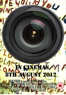
Next I opened up a text box and chose a font for the ‘In Cinemas’ part that I saw and thought would be in keeping with the film poster feel! I thought that bold and straight edges would show a demanding and slightly masculine element to the movie which is in keeping with the target audience for our film.

Also I chose to reduce the intensity of the colours in the background as it became difficult to read the text without your mind being preoccupied with the background.

A problem I faced was not only the background colour intensity but also the overall style of the text. To fix this I chose to put shadows over the lettering in order to make it more effective.

Next I focused on the text I wanted to be around the camera lens. I opened up another text box and wrote the specific words that I wanted to be around it.

This was a task which took a certain amount of time as after I typed what I wanted the text to be I had to warp it and rotate it. At first I type the whole sentence as a whole but I quickly realised that when I wanted to rotate it the words would go over the lens and be placed onto the background which is what I didn’t want. Therefore I had to type the words separately in order to create what I actually wanted.

My next step was to add an image of Ali Hussain, who plays the main character, into the poster. This is a key element as it shows the audience who the film is based on and they can have interpretations of his characters personality simply from his appearance in the poster.

It was a very light image before so I used the lightness tool to make it darker so it seemed more realistic that he is trapped in the lens which is a subtle hint to the twist in the film.

After I changed the lightness in the image of Ali I then changed the size of his picture so it would be able to fit in perfectly within the eye of the lens.

I then created my own credit block on a separate document using the text box tool in order to fully establish to the audience the production company, director, producer ETC.

One of the final steps was to remove the previous temporary credit block and take my own one and transfer it onto the actual poster. And lastly I resized the credit block and the poster was complete. (SEE BLOG ABOVE FOR COMPLETE POSTER!)

RESEARCHING FILM MAGAZINES.

8 Feb

During the lesson we were asked to research a variety of UK film magazines.

‘EMPIRE’ is a very well known company who review many genres of film and also span from low budget to big blockbuster movies. However they are mainly known for their blockbuster movie reviews. The website is attractive to the eye as it uses bold catch colours which clash yet compliment each other. The target audience is aged 15-35 I believe however it gives off the impression of a mainly male readership as it is very manly once you analyse it. The use of sharp edges and block fonts give off a male impression which reflects largely on the style of writing.

‘SIGHT AND SOUND’ is an international independent film news magazine; which features in depth interviews with the films cast and various other people such as directors, producers ETC. The target audience is aged 25+ as it uses quite dark colours to portray a serious film fanatic effect! Focusing more on independent, art house films it has a high regard in that area even though it is not as popular as say, ‘EMPIRE, but it still has an extremely strong following.

‘LITTLE WHITE LIES’ is a completely different type of film magazine as although they cover near enough the same type of films their approach to it is completely different. EMPIRE have quite an informal and jokey feel about their reviews whereas ‘LITTLE WHITE LIES’ is very formal in their use of language. Also the target audience seems to come across as those aged 15-25 as the use of bright colours in some of their images and titles usually attracts those of a younger generation.

These are some of a wide range of magazines that are available which review films and I do believe that each of them do their job very well. They are all able to attract their target audience through the layout, fonts and imagery used as they do this well.

TASK FOUR. CREATING A POSTER FOR THE SHORT FILM.

25 Jan

The next step after poster analysis of other films was to get involved in making our own posters in order to advertise our short film. Within our group each individual member was asked to create their own poster which depicted a certain aspect to draw the audience into the film.

I created an almost, mix between a teaser and showcasing the main actor and director. The poster was created by using Photoshop, previously I had never had any experience with Photoshop so it was a completely new area for me to explore. After a quick tutorial from the media technician I was equipped enough to start created my own poster.

My first idea was inspired by a ‘Black Swan’ poster as it has elements which related to my short film such as the crack in the face to represent a person on the inside slowly breaking down. I adapted the image to create a fresh innovative one in relation to my short film by having schizophrenic style writing on the collar of the main character in the poster and question marks ETC to show the confusion within. Also I wanted this poster to be one in which showcased the actor in the film as it is a close up image of the main character.

My second idea was to have two profile shots of the same main character but put them on the page facing each other in order to let the ideology of a madness and a split personality shine through. The main aspect of this poster to focus on is the text used in it as the letter P in ‘Project Paranoia’ reflect one, a television which insinuates watching something and two, an eye which creates a more private/personal sense of watching someone or something.

Initially these were my two main ideas but after an in depth discussion with my media teacher she gave me feedback on the elements she liked of both posters and how they could be put together to create an even better poster. Therefore, my third idea was to have an enlarged image of a camera lens which had the main characters face in the eye of the lens to show that he is the focus of the film and he is trapped in a camera, which subtly relates to the twist at the end without being too obvious. And the background of the poster is to have schizophrenic writing on it to portray the first half of the film.

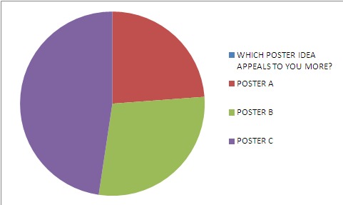
From my ideas I decided to choose the 3rd poster as it had more depth and interest to it. I also chose this poster as we were asked to create a questionnaire to give out to our target audience and from the research I gathered from that, the third poster was the most appealing. Below is a questionnaire from a person who chose the 3rd idea.

Also I created a pie chart (SHOWN BELOW) in order to show how a large majority of the target audience who completed the questionnaire preferred POSTER C which was the third idea.