Archive | January, 2012

TASK FOUR. CREATING A POSTER FOR THE SHORT FILM.

25 Jan

The next step after poster analysis of other films was to get involved in making our own posters in order to advertise our short film. Within our group each individual member was asked to create their own poster which depicted a certain aspect to draw the audience into the film.

I created an almost, mix between a teaser and showcasing the main actor and director. The poster was created by using Photoshop, previously I had never had any experience with Photoshop so it was a completely new area for me to explore. After a quick tutorial from the media technician I was equipped enough to start created my own poster.

My first idea was inspired by a ‘Black Swan’ poster as it has elements which related to my short film such as the crack in the face to represent a person on the inside slowly breaking down. I adapted the image to create a fresh innovative one in relation to my short film by having schizophrenic style writing on the collar of the main character in the poster and question marks ETC to show the confusion within. Also I wanted this poster to be one in which showcased the actor in the film as it is a close up image of the main character.

My second idea was to have two profile shots of the same main character but put them on the page facing each other in order to let the ideology of a madness and a split personality shine through. The main aspect of this poster to focus on is the text used in it as the letter P in ‘Project Paranoia’ reflect one, a television which insinuates watching something and two, an eye which creates a more private/personal sense of watching someone or something.

Initially these were my two main ideas but after an in depth discussion with my media teacher she gave me feedback on the elements she liked of both posters and how they could be put together to create an even better poster. Therefore, my third idea was to have an enlarged image of a camera lens which had the main characters face in the eye of the lens to show that he is the focus of the film and he is trapped in a camera, which subtly relates to the twist at the end without being too obvious. And the background of the poster is to have schizophrenic writing on it to portray the first half of the film.

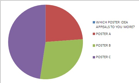
From my ideas I decided to choose the 3rd poster as it had more depth and interest to it. I also chose this poster as we were asked to create a questionnaire to give out to our target audience and from the research I gathered from that, the third poster was the most appealing. Below is a questionnaire from a person who chose the 3rd idea.

Also I created a pie chart (SHOWN BELOW) in order to show how a large majority of the target audience who completed the questionnaire preferred POSTER C which was the third idea.

TASK THREE – LOOKING FOR ERIC POSTER ANALYSIS.

15 Jan

During the lesson we watched the trailer to ‘LOOKING FOR ERIC’ and analysed the various posters that were released of it. It was a clever marketing technique to release a variety of posters as it attracts attention from all audiences as each convention is changed which makes each poster specific towards the target audience it is attracting.

From the trailer it gives off the impression that the main character is quite gloomy and has had a hard life for the past few years and he turns to inspiration from Eric Cantona for help and guidance in his life. Through the beginning sequence of the trailer the music is quite sad and slow paced to reference the mood that the character is in and how unfulfilling his life is however when Eric Cantona appears on the screen the music is instantly uplifting and lightens the mood.

It is instantly recognsible as a British film as they are often linked to a more rough style of living, which is portrayed through the setting and environment and also the colours used link into the British film genre as it is quite dull and dreary which is often used to reflect the weather that is commonly associated with the United Kingdom.

The main USP (UNIQUE SELLING POINT) of the film is that they have Eric Cantona who is a fully fledged and regocnised footballer which is not something any of the films in the market had at the time thus it was able to draw in a large audience which may not be attracted to other films that were out as they did not attract the true “football hooligan” inside them.
The audience of the film would range from men aged 30 – 40+ as they would be interested in Eric Cantona as he was in the height of his career years ago so an older generation would be more inclined to the film as they know of him. Also football fans would see the film for obvious reasons, and they could string from Mancherster United fans, French football fans, Eric Cantona fans and just general football fans as there is a very niche market for such films. And finally women may go to the film as in his day Cantona was seen as sex symbol!
This poster is key in presenting to the audience the Director of the film as it is solely based on the text as it is in the middle. It also gives away hints that the Director is a British one due to the bricks which is usually associated with British films as they are normally based in areas in which are council flats, one bedroom houses ETC which is portrayed ever so slighty through the use of the brickwall. The graffitti also links into the feel of the movie as it makes you think of the area it would be set in where graffitti is the norm as it is usually on every corner.
The distance between the two gives away hints to the storyline as it shows how far away the main character is from his ideal representation of himself and shows the longevity of the task he has ahead of him. This point can also be seen through the use of props in the poster as the main character Eric who is the Postman is holding a mask of Eric Cantona which puts emphasis on the fact that he is not the person he wants to be and Eric Cantona is his idea of who he should be.

This poster is used to attract a different audience as it has a ‘ROM COM’ feel to it which would most likely attract women. The use of round edges on the letters give a slightly more feminine touch to the titles as they are curved and neat rather than jagged and rough which is usually used for some action films ETC.

The main character Eric is holding flowers which are a common gesture of romance and the body language of himself and the woman in the shot with him show that they are a couple. However links to a comedic genre are used as Eric is not looking at his partner but his eyes are drifting and looking towards Eric Cantona to almost show to the audience that his love for Cantona is bigger than his real life love which shows that he has more time for Eric. This gives away hints to the romance side of the storyline in the film and also the use of the image of Eric Cantona shows that he is a guide to the main character as he takes up the majority of the poster and has quite a serious look on his face, the key thing to point out is that the image is slightly faded which shows that he almost isn’t there.

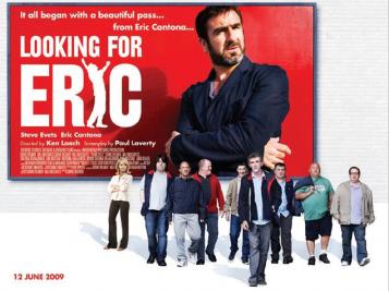
This poster has been created in such a way to attract British film fans as it is made in a ‘quirky British style’. This is done by showing all the individual characters personalities in such a way as to portray the film without giving too much away and it simply showcases the nature of the storyline.

This is done by the use of their body language, for example many of the men are shown in a ‘lad-ish’ sort of way to portray them as quite rowdy and typical British men. And the female characters body language portrays the relationship she has with the main character who is her partner as she is quite stubborn in her demanour which represents perhaps, the arguments they have in the film.

TASK TWO – POSTER ANALYSIS.

10 Jan

Film posters are a substantially large aspect of the marketing of film as they can be seen by your target audience at all times and anywhere. They give away slight hints about the genre and storyline of the film which enables people to decided whether or not they want to see the film, thus making it crucial to have an effective film posters.

The key to creating a film poster which attracts a wide variety of audience members is to make more than one poster and change the conventions each time to link to a certain genre in order to attract members of a different target audience.

FILM POSTER CONVENTIONS:

  • TITLE
  • TAGLINE
  • MAIN CHARACTERS
  • DIRECTOR
  • PRODUCER
  • MAIN CHARACTER CAST NAMES
  • CERTIFICATION

In order to gain influence for our own posters we were told to look at other posters which link into our own genre/storyline of our short film.


The film ‘BLACK SWAN’ is extremely similar to ours in the portrayal of paranoia and schizophrenia. The split personalities of the main character Nina are subtly shown through the poster as there is a contrast of black and white which references to Ying and Yang, the notion that there is good within the bad and bad within the good.

Also the use of heavy dark eye make up links to the schizophrenic storyline as it is a commonly said that the eyes are a gateway to the soul and the soul is essentially ‘split in two’ with suffers of schziphrenia as they alter in emotions and characteristics through the split personality disorder.

The focus on the eye area emphasises this point as it showcases it to the audience and lets them know it is an important aspect which is why the rest of it is slightly blurred.


In contrast to the previous film poster ‘SON OF RAMBOW’ is similar to our short film as it relates to our ending because the main storyline of it is about two young people making a film. As it is a British film and doesn’t have well known actors in it, it is clear that one of it selling points is the reviews as apart from the title, they are the only text on the poster.

Also the element of immaturity is shown as the ‘W’ in Rambow is coloured in as in the orginal Rambo film there is no ‘W’ which shows that there is a link of comedy in the film. However there is a sense of seriousness in the poster through the posture of the characters on it which could be done with our film as our main character is portrayed as extremely serious in the beginning of the film.

Therefore we could also use slight hints towards the element of comedy through certain aspects of our own poster.

TASK ONE – DISTRIBUTION AND EXHIBITION.

3 Jan

As part of our project we were asked to expand into the media area wholly so therefore the distribution and exhibition of our film came into play.

PRODUCTION.

As our film is quite obviously not on the level of those in which are Hollywood produced we had to take that into consideration as it would seem far fetched if we were to say that it was produced by ’20TH CENTURY FOX’ or ‘UNIVERSAL STUDIOS’!

Therefore we decided that it should be produced by NICK GOLDSMITH, a well known British film maker who is part of ‘HAMMER & TONGS’ production company.

NICK GOLDSMITH

We chose this company as it has produced a film which is similar to ours called ‘SON OF RAMBOW’ which consists of a storyline following film being made, which is similar to the ending of ours.

DISTRIBUTION.

We decided that it will be distributed virally on various social networking sites such as Twitter, Facebook, Youtube ETC as they are a fast working way to get attention towards a film as they act like a game of ‘chinese whispers’ in the sense that once it has gained attention in one area it will be passed on to others and hopefully making it a hit.

Also it is where the basis of our target audience lies as usually teenagers engage in social networking activity and our target audience is those who are 15+.

Our presskit would include:

  • Action screenshots from the film
  • Synopsis
  • Posters (teaser)
  • Trailers
  • Film reviews
  • Character/director interviews

EXHIBITION.

The topic of exhibition was an interesting one as before the twist in our short film the style of the film is very American which made it seem as if it could be distributed worldwide however the twist at the end is a very British one and after discussion we decided that it was an ending in which we thought mainly British film goers would fully enjoy. Which is why it will be distributed in the UK.

It will be shown in film festivals such as CANNES as that is a platform on which many film makers are able to get attention and recognition for their films as there are many willing people looking for potential films.

If it gains a sufficient amount of attention from festivals it will then be shown in multiplexes across the UK as very British films such as 4.3.2.1, Adulthood ETC gained a large audience due to the British nature of the films.